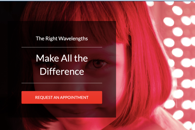
Inner Health Clinic
Quelling fears of a new technology to increase bookings;
a chiropractic clinic adds Red light therapy to their services

Project Details
Type
Responsive Website Design + Rebrand
Emphasis
UX Research, UX Writing
Length
4 weeks, August 2022- Sept 2022
Tools
Figma, Google Sheets, Google Docs, Pen and Paper
Role
UX Researcher, UX & UI Designer
Personal note
I believe it will be vitally important in the near future (and now) for companies with alternative technologies, particularly solving climate problems, to be able to address user concerns for quick adoption. I approached this project with this question in mind:
What is required for users to change their behavior & choose to adopt new technologies?
Background
Dr. Taylor is a licensed chiropractor with a clinic in Wake Forest, NC. She was introduced to Red light therapy (RLT) and became a walking testimonial because it cured her eczema. Because of the success she witnessed, she decided to scale her clinic services to include Red light therapy.
She needs to build a separate responsive website and rebrand her business so people in the community can find her services, see value in it, and decide to get a consultation.
Problem
Potential customers don’t know about the client’s Red light therapy services and, since it’s a newer technology, aren’t familiar with the value, so those who do know about it, have a lower willingness to pay.
Solution
Communicate the full picture of Inner Health to the community to increase booking and create high value for customers to be willing to invest in this service
Goal
The goal is to grow this new branch of business, increase bookings and revenue by end of year.
Prototype
Proof of Concept
Beta testing breeds early success and confidence
Before I got started, I was curious what the demand was for a service like this. The client shared with me the early success she had found so far with a simple landing page and phone number to call on it.
Week 1 Results
people clicked to get information or prepay for consultation
69
click to book rate
10%
closing rate (consult to package purchase)
57%
Conclusion
The service is desired in the community and it is time to get serious about growing it.
Current Website
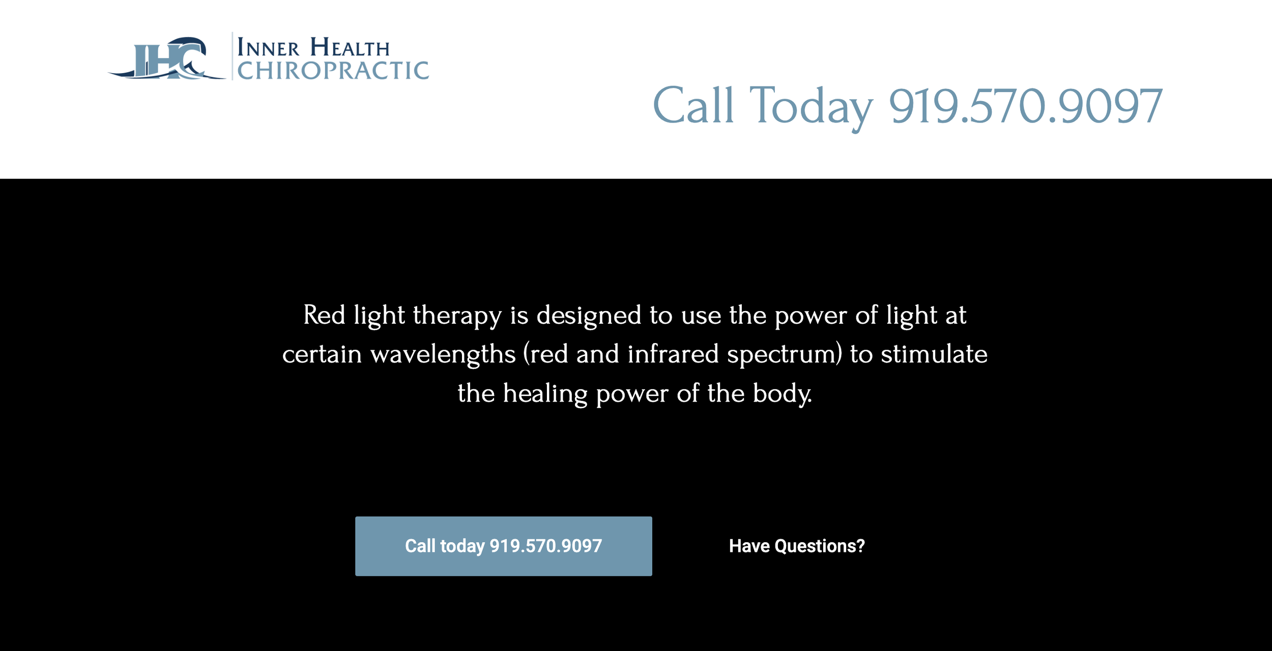
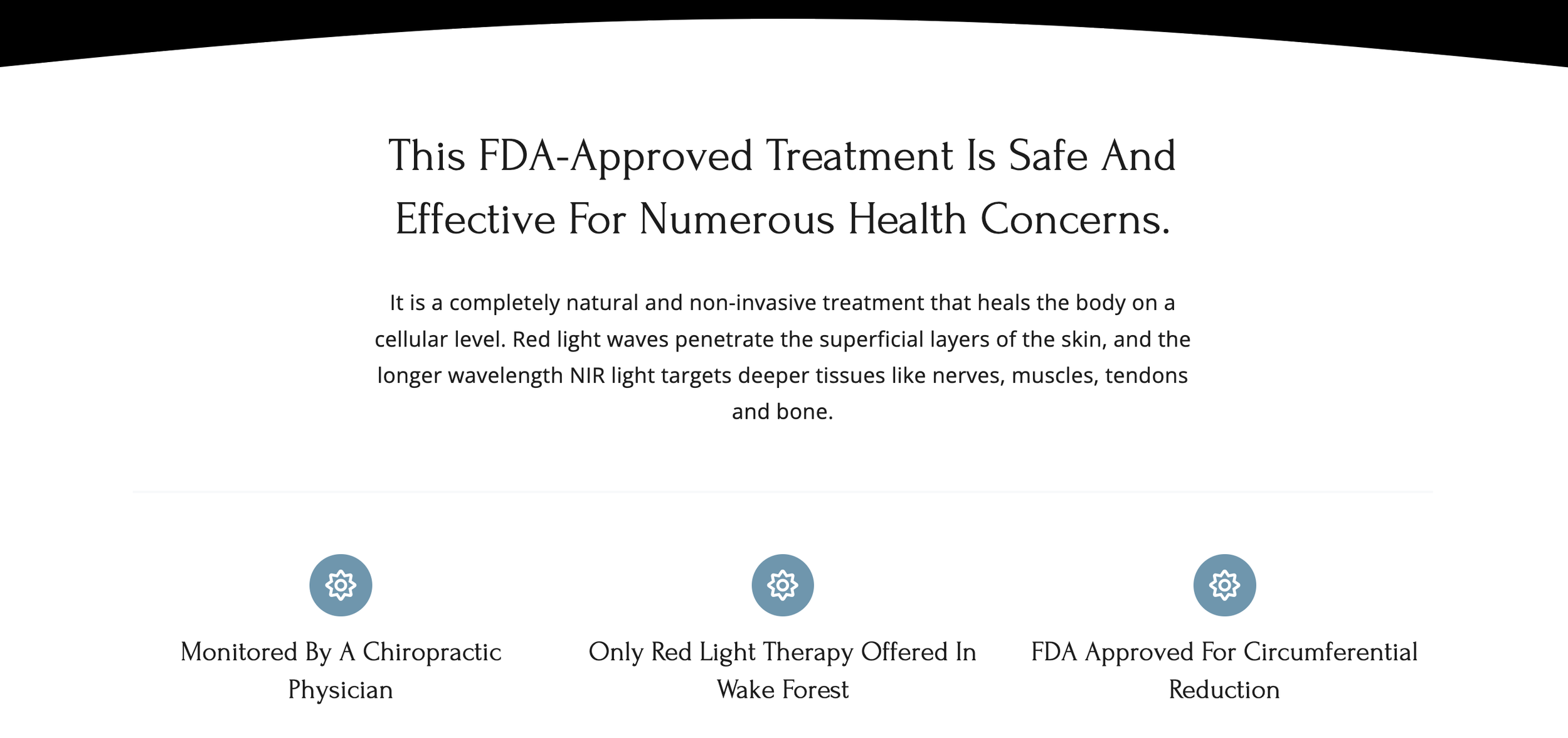
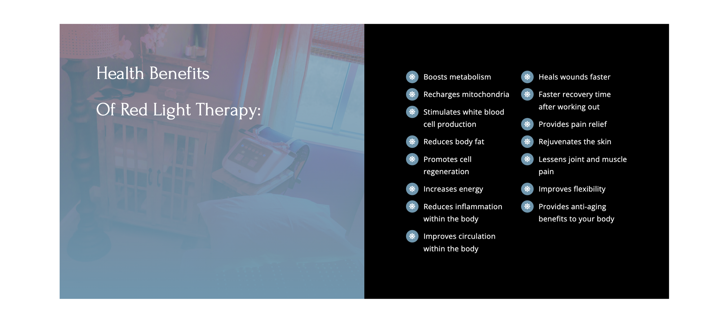
Working with the Client : Needs + Constraints
Needs
The client is the brand, don’t PASS GO before understanding her as the brand
Since the client has her own practice, she is the brand. I needed to understand her to get a feel for the branding of the website.
3 things she wanted all customers to know:
how her services differ from others. Ex. customers are cared for, customization provided, doctor present.
what to expect
that the science and studies are provided, which build credibility in RLT technology.
Constraints
On our first phone call, the client shared a list of constraints for design.
3 constraints:
Customers can’t book their own appointment
Dont mention the price
( I hypothesized this was coming from of fear from customers balking at the price, so she might think the price would steer them away)
The site is solely to educate
It was going to be difficult to bring value to her beyond creating a templated landing page with these constraints. I listened and decided to discover through market and user research if these constraints would keep her from growing her business and her own goals? If so, I would propose win/wins where possible for user and business owner.
Who is the user?
Target user is not “everyone”, even if it helps everyone.
I asked the client who her target user was, she replied everyone can benefit from it.
I knew my first task would be to narrow the user focus to really understand the problem this service solves.
Don’t start from scratch, even a facebook group can bring some clarity.
I wanted to know who had already benefited from her services, what problems they had faced, and solutions they found. Most of this was available on her facebook business page.
92%
84%
40-80 yrs old
55%
weight loss was top benefit
Provisional Persona
How familiar is the user with Red light therapy (RLT)?
Context
I started to have a picture of my target user! Next, I wanted to understand the context of my user, prior to converting to red light therapy.
Problem
Hypothesis
Solution
Users who had already experienced red light therapy had a bias. They already knew about it and had tried it. I wanted to understand if my user would have any prior context of red light therapy.
The user “pre-conversion” would not actually know much about red light therapy because it is still a niche technology.
Validate (or invalidate) hypothesis with quantitative data - instastory poll
POLL
QUOTES
With these lower numbers, validating my hypothesis, I set out to discover more about the technology, the market, the users, and ensure I was designing for the right problem..
The Process
Discovery
Define
Design
Delivery
Market Analysis
Competitive Analysis
Interviews
Contextual inquiry
Personas
Customer Journey
Problem Statement
Sitemaps
Flows
Sketch
Wireframing
Visual Design
Hi-fi design
Prototype
Usability Testing
Iterate
Discovery
My questions guided the type of research I decided to conduct. I ended up going on a bit of a journey as my user would be going through, whether they would do it consciously or not. So, bare with me, you may even learn some cool facts yourself.
Research
What problem does RLT actually solve?
Secondary research
How are people currently solving that problem?
Market analysis
How might RLT stand out against the traditional solutions?
Market analysis
What are current competitors doing in the space?
Competitive Analysis + Contextual Inquiry
What would motivate a user to find an alternative solution?
User Interviews
Skip this section…
if you don’t like random cocktail party information
History
Science
Red light therapy was used in the late 1800s to treat skin tuberculosis.
Then, in 1980s NASA used it to try to grow plants in space and astronauts noticed wounds healing faster by helping cells and tissue growth
Red light is a wavelength that penetrates the deepest of all visible light into dermis of skin and into the mitochondria of cells (the powerhouse energy of cells).
Here, it gives energy and is thought to stimulate proteins s/a collagen and elastin which remove damaged cells and promote repair.
Just like the sun that creates power and energy for solar cells which gives us electricity. Red light sends power to the cells that distribute energy to the body!
Secondary Research
What problem does Red light therapy solve?
Due to the collagen and elastin production to promote repair in cells, this means one can physically notice certain results from RLT:
Benefits
A safe & noninvasive way to :
improve skin appearance to solve the issue of scarring, acne, wrinkles, fine lines.
help with inflammation to solve the problem of joint pain.
may also support weight loss and stress reduction to solve issues of excess weight or anxiety
How are users currently solving these problems?
Skin
Weight
Pain
$$$$ in creams
UV therapy
Dermatologist
Botox
Cool sculpting
Liposuction
Laser therapy
Dieting
Pills
Medications
Market Research
How can you get Red light therapy?
If someone did become aware of red light therapy benefits for their problems, where would someone look to find the services?
This would start to inform me of the competition.
Chiropractors
Wellness “gyms” offering IV drip, infrared saunas, cool sculpting, etc.
At-home products
Market Trends
Why now? Why did this feel like something that was trending? (and also flooding my social media and incepting my own experience since I was now furiously googling red light therapy).
Popularity
It’s thought to have risen in popularity because people want more holistic ways of solving health issues, not just medicating to cover symptoms.
Because the LED technology has vastly improved, making it safer, cheaper, and more effective than ever before.
Studies and more evidence than ever before - both anecdotal and peer reviewed studies showing its success.
Based off of my research, it seemed the client was “at the right time and place” to catapult this as an addition to her business.
Comparative Analysis
What are current competitors doing to be successful and where might there be opportunity?
The logical next step was to dig deeper into the businesses currently offering red light therapy.
I wanted to try to focus only on businesses local to the client around Raleigh, NC, since they would be her direct competition.
Problem
WEAK competition! There were not many competitor websites that were even in the boxing ring. The bar was pretty low. It definitely helped show me what NOT to do.
Outdated design - Early internet days
Low quality UI - inconsistent and confusing use of color
Stock photos - have little correlation to text
Bulk amounts of text
Solution
Find an aspirational competitor solving a problem a similar way.
I chose Oura ring because it’s an alternative technology that supports wellness AND the business success, design aesthetic, plus website traffic make it an aspirational match. I was inspired by the short explanations, icons for text when possible, excellent data visualizations, and photos that tell a story.
I had a firmer grasp on the niche technology, the industry, and the competition. I was ready to get to know who i would be building for : the user
Quantitative & Qualitative Research
What type of user would be motivated to seek alternative wellness solutions?
Quantitative Research
Method = Survey
Why = to understand what percentage of people are open to alternative forms of wellness and to get an idea of the time, money or real work people take in solving anti-aging or weight loss solutions
Qualitative Research
Method = User interviews
Why = help me discover how a user currently solves for pain, anti-aging or weight loss, what their motivations, concerns, and priorities are when trying something new.
Quantitative Research
The survey validated people are actively investing $$ in solving these issues (pain relief, anti-aging, weight loss) and doing so with an open mind to alternative solutions.
The survey also confirmed there is a LOW knowledge factor for RLT, therefore I cannot assume the user knows anything about RLT when they arrive at the site.
85% had a history of skin issues
77% open to alternative forms of wellness
62% never heard of RLT
Low knowledge of what RLT is, “helps with your skin?”
Customer Buying Decisions
The survey supported the business case to be able to book an appointment online. If the client wants to capture a lower age audience, she must invest in making the user have an easy way to book.
83%
26-40yrs surveyed said theyre less likely to do business with a company when they cant book online
Biggest factors influencing the decision to try a new solution:
Understanding the benefits (64%)
Science/ clinically proven (55%)
Cost & Testimonials (46%)
Qualitative Research
User Interviews
100%
100%
users took action on wellness because of a referral.
which means: people will most likely be coming to the site not from a cold google search, but from a referral
users are motivated to try something and use it if it feels good.
which means: communicate they will have a calm, relaxing experience and it’s fun.
**For new wellness technology, it is very important to visually take the user through what to expect and what their experience will be.
Contextual Inquiry
In my competitive analysis I noticed how “old school” the design of local chiropractic websites and wellness franchises were.
I wanted to discover the user experience of these old designs.
I found: It was as bad as I thought. Users were annoyed, confused, and unimpressed.
This was perhaps the most detailed discovery that would start to inform my design decisions. Based on the inquiries, I moved forward in the process keeping these principles in mind:
Communicate how long the treatment takes + how often user needs to go
Communicate that its consultative, doctor present
Visuals matter! Use photos that show the experience
Don’t use long paragraphs for information. Share in three points instead.
Don’t use a chatbot & popup immediately. Let people feel out website first.
Use huge testimonials below the fold where user doesnt know they can scroll.
Define
User Personas
Design the MVP for the user I’m solving the BIGGEST problem for, typically the most frustrated and motivated
Shannon: The most frustrated and motivated to solve issues of anti-aging and weight loss.
She’s tried many things in the past, and doesn’t quite care if its fully scientific, if it works for others, she’ll try it for herself.
Cares about doctor being present, consultative services, and good feels
Core User : Shannon Duluth
She’s a young mom, starting to feel a few aches & pains from aging, has scars from teenage days.
She is super busy, needs to be informed quickly, know what the commitment is, she’s straight forward.
She cares about time and efficiency, 1:1 care, and good feels.
Secondary User : Becca Strickland
Customer Journey Mapping
How to make sure the first date leads to another
The customer journey gave me the binoculars to start putting clarity and focus on design within context
Where is she coming from?
Whats the purpose of the page?
Where are we going next?
Before I get to designing one iota of flows or frames, I always stop here, reconnect to the business and user goals and define exactly what it is I am solving for.
Shannon needs to see that the experience will feel good and be calming because she’s done with pain for beauty sake.
Problem Statement
Becca needs to quickly see how RLT might benefit her. She does desire to invest in preventative measures & take care of herself
How might we design so Shannon feels safe and knows she is in good hands?
How might we limit the burden of knowledge input, so Becca feels at ease when digesting and learning about RLT?
Design
Design Solutions
Make it easy to make decisions
There are so many ways red light therapy can benefit someone, my user research showed it’s almost overwhelming to put the puzzle pieces together.
My solution - put the puzzle pieces together for the user - first, visually show the issue for user to connect to and then RLT solution.
Design CTAs at the bottom of every page- user doesn’t have to search; once she learns more, she can take action.
Accordions for questions - Don’t drown the user in information. Communicate the essentials, then give the user the opportunity to learn more. Put the control in the users hands.
a)
b)
c)
Paint the picture
Show the user the whole experience, through visuals and language. Don’t leave them left with any unknowns or concerns.
a)
Show RLT beds, and people using the equipment
Use language like - “spa like experience”
Mention multiple times and in headers “doctor present”
I created task and user flows too. Check them out here. Honestly, I always resist these but when I do them I always discover the clarity it brings to know exactly what pages to design and the purpose of each one. Plus, where the user has come from, what knowledge they’ve gained from previous step and what their goal is on the next page.
Design Challenges
Create “win-wins” for business and users
In our initial call, the client had shared a major constraint & biggest challenge.
Here is how I decided to solve with these in mind.
Constraint
Conflict
My solution
Business win
User win
Client says customers cant book an appointment
Users want to book (83% said theyd be LESS LIKELY to book w/o online appt)
Create a flow to REQUEST a consult
Leads to higher bookings and conversions
Meets user needs = user satisfaction
User needs to see value (and results) to be willing to invest
User problem
"If I’m going to pay a good chunk of money, I want to see results.”
“I went into it (first RLT package) with just the targeted amount of time in mind. I didn’t think about it being a part of an ongoing wellness program, but maybe now i might.”
Business Challenge
Customer willingness to pay. When I first met with the client she was concerned because “Customers thinks it’s too expensive”, their finances is the only thing that holds them back
a)
Build value through the whole journey
Communicate what they’re getting for the investment
Give price comparison to show savings
b)
Visually show results for others + user
Use before & after photos to show what’s possible
Bring users’ results to their awareness to increase engagement and retention
In the user interviews, users who’d experienced RLT stopped when they couldn’t SEE results, even if they were felt. For users who tried other solutions, they didn’t keep up the solution when results weren’t visible.
How might we bring the invisible into the visible?
1. Bring visibility to results
2. Show value for investment
Solution: Dashboard (prototype above)
*this was out of scope and would be another feature and separate project for the client to be able to build. However, for the sake of practice and learning about habit forming, I took the project on.
Visual Design
One of the responsibilities for this project was to recreate the logo and branding for the clinic. The current branding was similar to other chiropractic businesses in the area with shades of muted blues that traditionally correlate to healthcare. While I wanted to keep a calm vibe, I wanted Inner health to be more distinct.
Keep it soft, but incorporate richer colors
Use red as accent to include RLT, but stay away from hue
Logo - stay away from silo of just chiro care, but lean more into the “clinic” and wellness aspect
Accessibility for user - for older age group: higher font sizes for better visibility, pay attention to color contrast
Inner health brand redesign
Wireframing
How to marry consistency AND diversity
I first sketched out various versions of the home page and services page. I knew I wanted the problem/solution feature at the top of the page, and I wanted to “guide” the user through a “hopscotch” like method of answering all the questions they had. See my sketches here.
Less is more
After two different wireframe designs and feedback, I noticed too much repetition which would end in boredom for the user.
To solve this I: Compacted information where possible
- to create user interaction to hover, click, and control information intake.
- to solve for the problem of “too much information overload” and attempted to lessen the knowledge intake burden
Break it up
I originally designed the services page in a “hopscotch like” pattern , to guide the user from one checkbox of answering questions to another.
However ,with testing and feedback, I discovered this could also lead to boredom and actually NOT take in as much information because of the repetition.
Breaking up the sections refreshes and keeps user engaged.
Delivery
Final Design
Prototype
Usability Testing
moderated user tests
40-70yr old
Successes
"It’s straight forward, makes sense, I like the colors"
"I like the focus of 3 things, it’s not overwhelming"
FAQ on service page was success since it’s a new technology
I expected a thought bubble, but I like that it (problem/benefit hover interaction) gives me the immediate benefit.
Pain point & Iterations
Clarify the ask
Highest priority
Success rate = 0%
I knew this was my #1 problem to solve for in my iterations. I had 0% success rate for my users understanding they had just requested, not booked a consultation.
Impact: The reputation of the client, the customer experience, and it negated any of the designs or successes up to that point in the flow, if the last experience the customer had was confusing.
Two solutions
a)
Language
Change language on button
b)
Hierarchy
Differentiation for important information - tested 3 iterations
*I retested this iteration and I actually found two EXTRA & MAJOR design iteration I would make on the next round.
Keep language even MORE consistent - use “consultation” the entire time, not “appointment” at all.
Add a second time request, if the first option doesn’t work. This is the strongest solution because it saves the user and business time of any back and forth AND by choosing two times, the user most likely would intuitively understand there isnt ONE confirmed time, but it will have to be confirmed.
Guide the eye
“My eyes cant follow and don’t know where to look” - User #1
The “hopscotch method” I employed, failed twice. Once from my wireframes and then hi-fidelity designs. I thought it would lead the user, but the color emphasis needed to tell the user what to focus on a split page with image and text.
Conclusion - be flexible
“hopscotch method”
Use color , white space and hierarchy to “guide the eye”
Dashboard - Dont make extra work
60% users said
I wouldn’t expect to do it, I’d want my provider to do it.”
The dashboard was a fun design challenge to build my skills in data visualization.
I received delight and surprise in the color choice.
I learned how to use color to only show the information I want the user to digest.
The pain point was in the service design - customers saw this as work to add inputs. My suggestion would be to have the doctor and patient fill out it together for ensuring completion.
Overall, I believe it was a success, but the “logging” and adding of information would need improvement
Conclusion
Next steps
Design presentation to client
Share the designs with the client - she intends to use these as a second iteration
Another round of iterations - most importantly, adding the second “time request” to the flow, so the user would intuitively know that it wasn’t a confirmed booking.
Pass off to developer for future the designs with the client - she intends to use these as a second iteration
Lessons learned
Working with a client involves working with more constraints and makes everything more real
I learned how valuable my sales skills and soft skills are for design.
The developer was confused about my job (she thought I was just putting photos into wordpress). I had a chance to show the impact and value UX design can bring.
Stay in focus and scope
The dashboard was outside of scope, and admit I was quick to make it from a small percent of the user interviews. If I’m going to develop a feature like that, it needs to be its own case study and full project. Even though the dashboard wasn’t a success I don’t think that means to scrap it. I would consider what a better question to ask is, ex)
How might I make it easier for a use have awareness of their results? What are the high value ones for the user?


