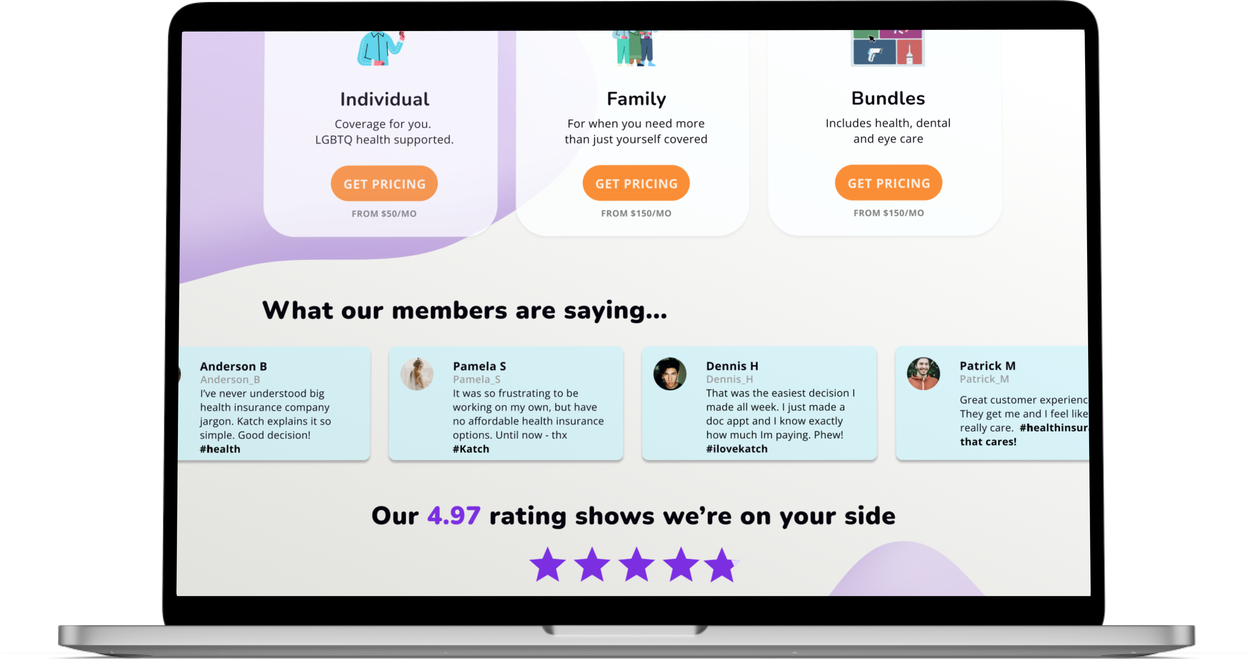
Katch Health Insurance
A responsive website redesign for a health insurance company for freelancers

Project Details
Type
Conceptual | Responsive website design + Rebrand
Emphasis
Information Architecture, Product Strategy
Length
8 weeks, March - May 2022
Tools
Figma, Miro, Whimsical, Optimal workshop
Role
UX researcher, UX & UI designer
Background
Kaus (rebranded Katch) has been in business for over 30 years. They have historically gained customers through agents and offered a wide range of insurance in bundles. The client approached us and wanted to now shift their focus to direct to consumer, and when doing so, only focusing on health insurance. They wish to make insurance easier to understand for consumers, specifically the younger millennial and Gen X generations.
Problem
The client had an outdated business model that was not growing their business. They struggled to reach the younger generations because of this old model.
Solution
Make health insurance easier and more digestible in a web format to lead to higher conversions.
Goal
A fully responsive e-commerce platform with a sleek modern feel that will expand their customer base to the younger generations (millennial and Gen Xers).
Prototype
The Process
Discovery
Define
Design
Testing
Market research
Comparative analysis
Interviews
Card sort analysis
Feature mapping
Sitemap
Flows
Sketch
Wireframing
Visual design
Hi-fi design
Prototype
Usability testing
Iterate
Ideate
User Persona Empathy Map
Storyboard Problem Statement
Discovery
Research
Research objectives
My core objectives in the research phase, that I wanted to learn and would guide my journey were based on the challenges I had identified thus far:
Understand the competition, to discover gaps and opportunities for ourselves
Determine the motivations a user has to purchase health insurance
Discover what users currently struggle with with their current insurance situation
Market Research
As I started to conduct market research, I discovered that within the “health insurance” umbrella, there is a MAJOR part of the population that are freelancers and have no, or little to no support or access to affordable health insurance options, and a large percent falls in the target age range the client was going after.
I started to see a possible opportunity for Kaus (rebranded Katch) starting to arise.
Hypothesis
There is a market for health insurance for freelancers and the self-employed.
The targeted focus for the client would be on a modern health insurance website specifically for freelancers and the self-employed.
The competition isn’t saturated!
In my analysis, I saw tons of auto, life, and rental insurance startups exist to shake up traditional insurance models; however, health insurance in the tech space has not yet been exhausted
Comparative Analysis
MUST HAVES
Easy to chat with person
Customer reviews very present
Simple language
Show quotes as fast as possible
WEAKNESSES
Confusing jargon
Can’t get pricing without signing up
Low coverage areas
User Interviews
My biggest “ah-ha” in the user interviews was health insurance was completely setup for those with full-time steady employment. There was nothing built into the system of health insurance that catered to those who might have a less steady income. Also, health insurance felt stuffy, old, outdated, and unrelatable, plus the users had a STRONG distrust for it completely.
people
interviewed
yrs old
Freelance artists
Don’t have health insurance
Frustration
User Goal
67% participants distrust health insurance companies
Lack of transparency in costs
Companies use big scary language
Mobile/web apps are too clunky and wordy
Not inclusive to freelance income. Only options for month-month.
Hard to compare plans across companies
Desire health insurance that is trustworthy, transparent, affordable, rewards preventative health actions, and includes holistic approach to health
User Desire
Know costs before medical visits/exams
Easily be able to see bills, pay online, have little interaction with insurance
Term/annual pay options
Simple interface
Terminology defined
To be rewarded for preventative health action steps
Define
User Persona
Who am I designing for?
What I learned about my relationship with a user persona through this project, is how I can refer back to her when I’m at each phase of the project. For example, when I was stuck on the language and Ux writing for the project, I came back to Adrienne and pretended I was talking to her. When I imagined she would most likely be on her phone and needed help, since she’s always on the go, that informed my designs and placement of contact information.
Empathy Mapping
Where the user comes to life
The empathy map allows me to understand visually and quickly what Adrienne would have to say about a specific design I completed. I dont have to remember or think too hard from interviews, because this deliverable gives it to me straight - all the things she is and isn’t saying.
Storyboarding
I chose to storyboard to put all the user problems I’d discovered into context. I wanted to discover where in search for insurance did problems currently arise and where would Adrienne really start to identify and connect with a health insurance company that was different from all the other ones.
Project Goals
Back to the basics!
Since I had changed and clarified the scope a little bit since the beginning of the project with the client, I knew it would be important to check back in and determine that it would still be something the client would approve of and the tech team would be able to build. I created this goals diagram to get “back on the same page.”
Problem Statement
How might we make it clear and simple to choose an insurance plan?
How might we help the user find a plan that works with their inconsistent pay?
Ideate
Card sort analysis creates the loose leaf blueprint
Information Architecture
The card sort was the invisible hand that guided how the navigation would be set. It also provided me the language to use that users would understand the most, this was probably my favorite part of the card sort. I discovered what would be nestled into “Find care” and that it would be named “find care”.
Paves the way and informs the pages to create
Site Map
Whenever I build out the site map, I become super clear on what pages I will actually be designing, and what CTA will be on each page to create action or guide to another page.
Task & User Flow
Design decision = Progress bar + Page by page information collection
Get a quote : One of the main design decisions I was going to have to make was how to give quote options to the user. This was a sticky point with the users and most competitors failed at this. They either collected too much information first, or they required the user to sign up before giving a quote, or the worst was they just collected the user information and said someone would call.
How to really stand out
Feature Analysis
Since I had chosen to get more specific with just health insurance for freelancers since the comparative analysis, I needed to get deeper in a feature analysis of companies that were a bit more “out of the box” and similar to the model we would be creating.
I was able to get clarity with:
I don’t need a search feature
Including flex pay plan options for freelancers
Using illustrations over photography to be more inclusive and modern
Include multiple forms of contact touch points
Design
Visual Design
The goal for the rebrand was to create instant trust and modernize health insurance.
Traditionally, health insurance includes primary blue colors. I chose to stay close to this, yet branch out with lighter and brighter shades of blue/purple.
To create the feeling of transparency and trust, I chose a glassy effect on the logo, and curved, organic lines to feel approachable. I chose a shape that represents “catching”.
From usability testing, 80% of users felt the logo was inviting, modern, soft, and approachable = success!
Katch Brand Design
Rebranding and logo
Wireframes
There were FIVE main values from Adrienne that I kept in mind while sketching and wireframing.
TRUST
use language that invites trust
give third party rating on website to show objective customer experience
SIMPLICITY
Since it’s overwhelming to choose a plan, try to make it enjoyable with characters instead of people in the design
TRANSPARENCY
break down the cost
show process to find insurance with a progress bar
in branding - have a glassy look/feel
FLEXIBILITY
designing for the user (freelancer) means considering they’re not salary. Their pay is more inconsistent.
give the user different options / payment plans
user is relatively healthy (gen z) younger and will have different needs than older generations, so let them choose whats important to get covered
ACCESS TO HELP
Since health insurance can be confusing the access to the company and humanizing them is super important - make it so so easy to get questions answers so someone doesn’t get defeated.
humanize the chat person
be able to call directly from mobile
Trust | Transparency | Flexibility | Simplicity | Access to help
Responsive Design
Stacking and expanding - themes of responsive design
As I imagine most ppl learn during designing responsively, was stacking and expanding to be able to see on small screens. Also, accessibility and spacing enough to not have errors with fingers/thumbs.
Hi-Fidelity Designs
Viola!


Testing
Final Design
Usability Testing
moderated user tests
female : male
Successes
"I can find what I’m looking for"
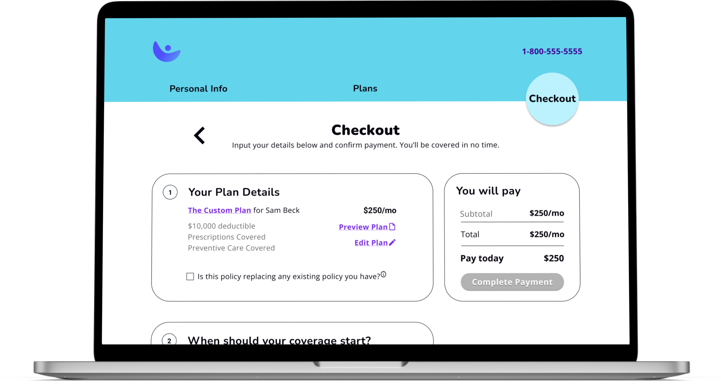
"The checkout was easy"
“I like the characters, they made me feel comfortable.”
“I love the customize option.”
Pain point & Iterations
All of the decisions below were taken from synthesizing my usability tests and completing affinity maps and priority matrixes to identify the high priority iterations. See here for my affinity map and priority matrix.
yr olds
Through the usability tests I validated the branding, the UX writing, flex pay plan, and character choices. Overall, the user felt like they could trust the company and that the company was on their side.
Conclusion
Next steps
Other revisions
Quantify importance to make a decision.
Checkout page - show users site is secure when adding payment info.
Add comparative pricing of other companies to show user savings.
Design the additioanl pages - find care, about us, resources, etcDetermine the need for/value of having “Resources” page - does user want?
Prototype Responsive design for all screens
Test again
Spec Tool - send designs to developers
Closing
I truly enjoyed working on this project.
I believe it is critical to solve this problem of health insurance for the younger generations and for freelancers/gig workers.
The feedback from users and stakeholders gave me confidence I successfully created and designed a platform that will create ease and trust with the user and market.


